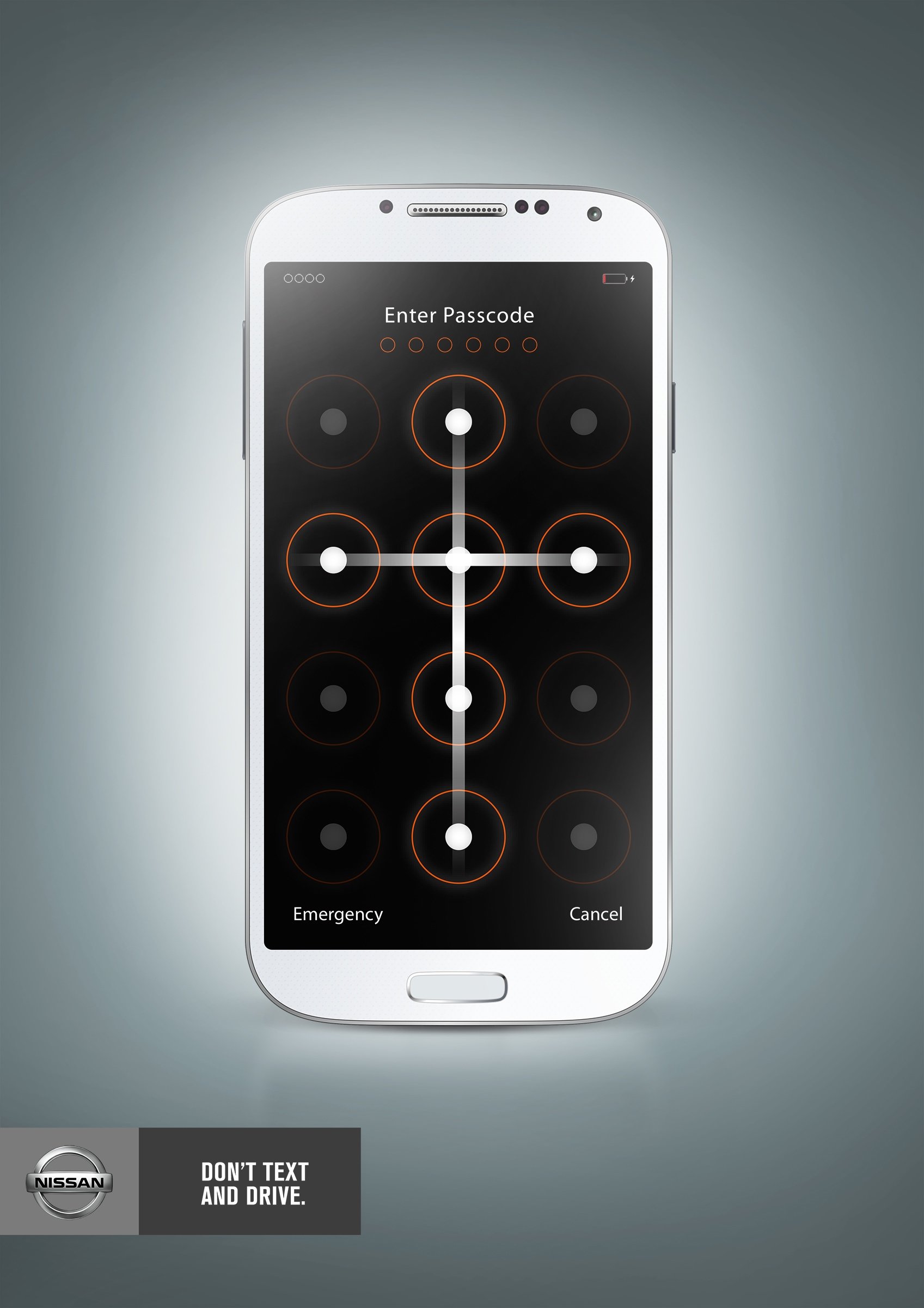
Advertisement Analysis Blog
Media: Print
Category: Automotive
Agency: Share
Brand: Nissan
Geo: Americas, Ecuador
Advertising Agency: Share, Quito, Ecuador
Creative Director: Fernando Gavilanez
Art Director: Kléver Mendoza
The Print Ad titled Don’t text and drive was done by Share advertising agency for product: Nissan (brand: Nissan) in Ecuador. It was released in the Jan 2014.
Media: Print
Category: Automotive
Agency: Bcube
Brand: BMW
Geo: Europe, Italy
Summer is here. Enjoy the sea.
Advertising Agency: BCube, Milan, Italy
Executive Creative Director: Sergio Spaccavento
Associate Creative Directors: Aureliano Fontana, Bruno Vohwinkel
Art Director: Alessandro Sciarpelletti
Copywriter: Silvia Savoia
Photographer: Garrigosa Studio
Published: January 2014
The Print Ad titled The Road to Nordkapp, Sea was done by Bcube, Milan advertising agency for product: BMW Motorrad (brand: BMW) in Italy. It was released in the Jan 2014.
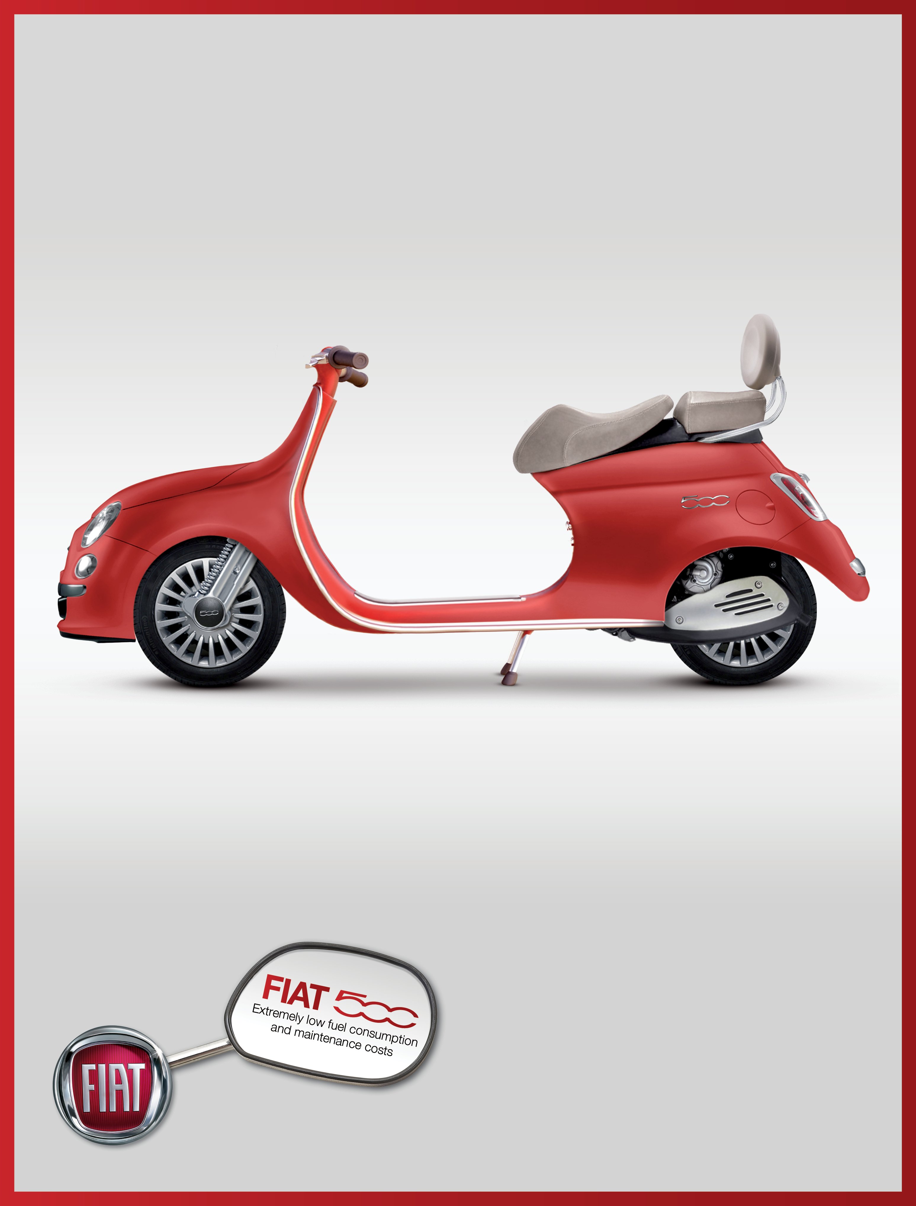
 My Thoughts:
The iconic Fiat 500 becomes a scooter in this ad from Drori Shlomi BBDO Tel Aviv
Category: Automotive
Media: Print
Client: Fiat
Agency: Drori Shlomi BBDO, Tel Aviv
Country: Israel
Executive Creative Director: Shahar Filer
Art Director: Tzahi Pitovsky
Copywriter: Moshe Geliss
The Print Ad titled Fiat 500 scooter was done by Drori Shlomi BBDO advertising agency for product: Fiat 500 (brand: Fiat) in Israel. It was released in the Feb 2014.
Media: Print
Category: Automotive
Agency: Oxigena
Brand: Nissan
Geo: Americas, Bolivia
Advertising Agency: Oxigena, La Paz, Bolivia
Creative Director / Copywriter: Ramiro Castillo
Art Directors: Ramiro Castillo, Marcelo Crespo
Published: April 2013
The Print Ad titled X-treme life was done by Oxigena advertising agency for product: Nissan X-trail (brand: Nissan) in Bolivia. It was released in the Feb 2014.

This design is for a Nissan SUV and I assume the ramp is there to show how “BOLD” the car is. The design was probably made with both Adobe Illustrator and Adobe Photoshop. The car is obviously a Photoshoped image and the ramp as well as the background seem to be illustrations made in Illustrator or possibly a different vector program used by professional advertising agencies. The logo was likely designed with Adobe Illustrator.
Elements of Design:
Size (of the ramp) plays a big role in this design. The ramp is there to show the boldness of the car. There is symmetry in the design due to the centering of the ramp. The gradient background gives the ad an upbeat value and the colors make it fun to view. There is balance in this design. The reds of the banner around the logo seem to be the same color of the car so it guides your eyes to notice all of the red colors.
__________________________________________________________________________________________
Category: Entertainment & Leisure
Advertiser: GOLD’S GYM
Product/Service: GOLD’S GYM
Agency: JOTABEQU GREY
Type Of Ad: Newspaper
Date of First Appearance: Jan 29 2011
Entrant Company: JOTABEQU GREY, San José, COSTA RICA
Chief Creative Officer: Alberto Quirós Feoli
Creative Director: Alexander Obando Araya
Art Director: Héctor Acuña
Photographer: Noelia Badilla
Account Supervisor: Wagner Cornejo Retana
The Print Ad titled Excavator was done by Jotabequ Grey Costa Rica advertising agency for product: Gold’s Gym (brand: Gold’s Gym) in Costa Rica. It was released in the Feb 2011.

My Thoughts:
This is a design by Gold’s Gym. It appears as if the gradient background was made in Adobe Illustrator and the photo of the man was probably Photoshoped and then made into a PNG and then pasted in Illustrator where the logo and colored segments of the body could be added. I would say the logo was made in Adobe Illustrator but likely saved as a PNG and then pasted into the image using Photoshop.
Elements of Design:
Shape comes into play here with the body taking up basically the entire design. The gradient background along with the photo of the human body gives the design a sense of texture. The color of the design is pleasing to look at and I like how the Gold’s Gym Logo has the same tone as the yellows in the rest of the design. Obviously there is balance with the body being centered.
__________________________________________________________________________________________
Media: Print
Category: Automotive
Agency: Grip Limited
Brand: Honda
Geo: Americas, Canada
You’re never alone.
Advertising Agency: Grip Limited, Toronto, Canada
Creative Director: David Crichton
Associate Creative Director: Ben Steele
Art Director: Yan Snajdr
Copywriter: Tom Mednick
3D Artist: Jody Wagner
Photographer: Robert Watson
Published: February 2014
The Print Ad titled Tow cable was done by Grip Limited advertising agency for product: Honda Plus Roadside Assistance (brand: Honda) in Canada. It was released in the Feb 2014.
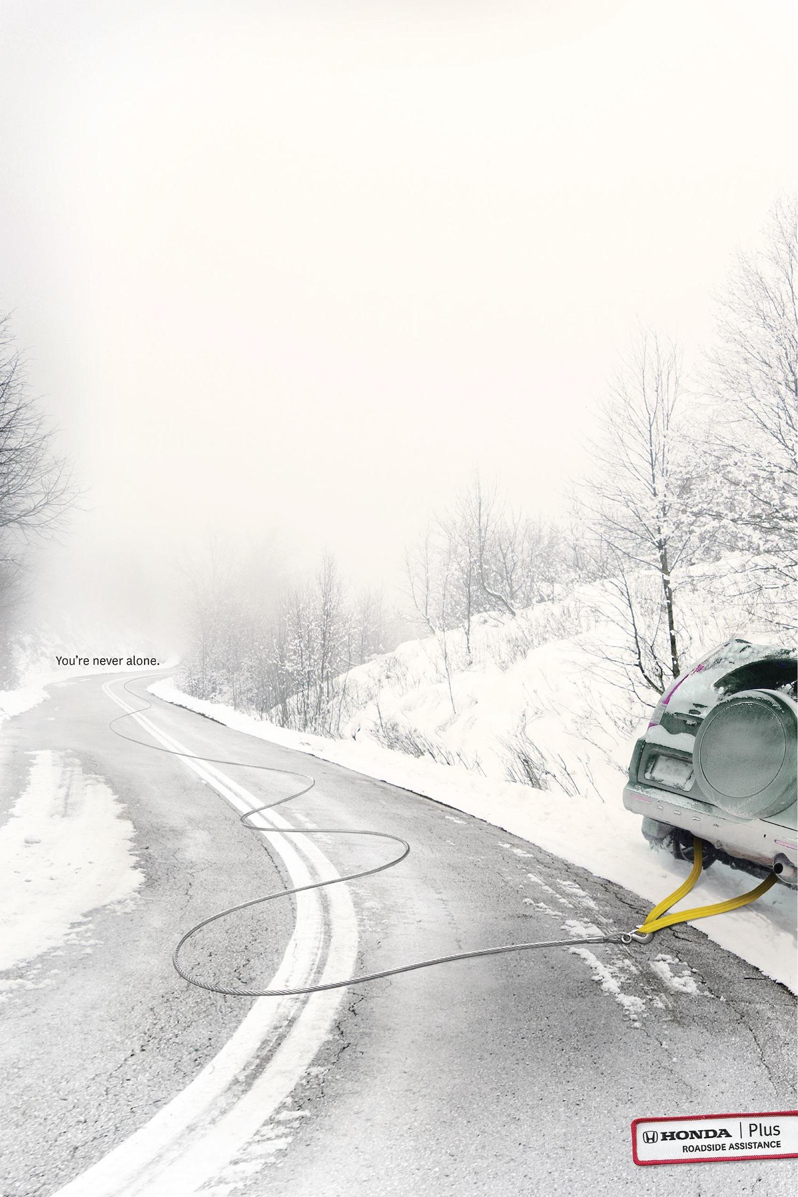
My Thoughts:
This is an advertisement by Honda showing off their tow cables. The design seems to be an image taken of a car on the side of the road in a snow storm and that image was pasted into Adobe Illustrator and the tow cable was added in Illustrator. This is a relatively simple design to make.
Elements of Design:
The use of direction of the lines leads your eyes down the road and following the tow cable. The tone and color of this design makes the entire design seem gloomy but the tow cable is the only thing in clear view. The contrast seen between the whites of the snow and the yellow of the tow cable makes the cable really pop out at the viewer.
__________________________________________________________________________________________
Media: Print
Category: Automotive
Agency: TBWA
Brand: BMW
Geo: Europe, Denmark
Happy Valentines Day
Advertising Agency: TBWA, Copenhagen, Denmark
Creative Directors: Tobias Aggergaard, Paul Clements
Art Director / Copywriter: Mikkel Møller
Published: February 2014
The Print Ad titled I love BMW was done by Tbwa\copenhagen advertising agency for product: BMW (brand: BMW) in Denmark. It was released in the Feb 2014.

My Thoughts:
This is a Valentine’s Day Advertisement from BMW basically joking around so it says “ I Love BMW”. The Ad looks as if it was made in Adobe Illustrator with the type and heart and some sort of handwritten font turned into shapes. The logo is also a vector that can be made in Illustrator.
Elements of Design:
Size comes into play here with the size of the text. The gradient tone of this ad is simple enough to make you only notice the text. The design has symmetry due to the centering of the text and the happy Valentine’s Day text at the bottom. The hue of the heart seems to look as you would expect.
__________________________________________________________________________________________
Media: Print
Category: Public interest
Brand: WWF
Trees save wildlife
The Print Ad titled Gibbon was done for product: WWF (brand: WWF). It was released in Feb 2014.

WWF Gibbon Advertisement
My Thoughts:
This is a public interest advertisement by WWF to help save wildlife. Looking at this design I would say that it was done completely in Adobe Photoshop. The animal was likely copied multiple times and placed on separate layers and then clipped and placed over the tree roots. The tree looks a bit pixelated so I would assume that it is not a vector so Illustrator was not used in this design.
Elements of Design:
Size comes into play here with the animal being the largest part of the roots. The textures of the animal’s fur are cleanly placed over the roots to look like the tree actually has furry roots. The direction of the roots and the animal bring your eyes down the page to the “Trees Save Lives” quote and logo at the bottom of the page. The animal/tree being centered givens this advertisement symmetry and balance as well.
__________________________________________________________________________________________
Alka-Seltser positioning in the former Soviet Union countries is a remedy against hangover. That gives a lot of inspiration for ads. A hangover can be very dangerous, that’s why you need a remedy that will quickly get everything in order.
The Ukrainian agency PROVID (former PROVID/BBDO) proceeds with its anti-hangover campaign with a new, New Year image.
Advertised brand: Alka-Seltzer
Advert title: New Year
Headline and copy text: Hangover is dangerous
Advertising Agency: PROVID (Kiev, Ukraine)
Agency website: http://www.provid.com.ua
Creative Director: Kirill Chichkan
Art Director: Denis Music
Copy-writer: Sergii Zinoviev
Photographer: Igor Chursin
Post Production: Denis Music
Published/Released/Aired (Month, Year): December 2008

Alka-Seltzer Advertisement
My Thoughts:
This hilarious advertisement is from Alka-Seltzer giving a statement that hangovers can be dangerous so use Alka-Seltzer for a morning without hangovers. Looking at this ad I would say the majority of the design is just a camera shot, the only thing that I believe was altered would be the urine and that was more than likely done in Adobe Photoshop with a line tool. I say that that was done in Photoshop due to the fact that the light on the plug looks to be hooked to power so obviously it would be too dangerous for the guy to actually be peeing on the plug.
Elements of Design:
Size is a factor in this design, the viewer immediately notices the large person peeing and then you notice that the plug is hooked up to the tree and has power. The color of the design is light and gives the feel of Christmas time, sort of like it was snowing outside. The centering of the person in the image gives balance to the design but the design is asymmetric since the tree is on the left side of the design and the room behind the person is empty. The floor also has an interesting texture, it is almost grunge looking.
__________________________________________________________________________________________
Advertised brand: McDonald’s
Advert title(s): Merry Christmas
Translation of headline to English: Merry Christmas
Advertising Agency (Name, City, Country): TBWA\Neboko, Amsterdam, Holland
Agency website: http://www.tbwa.nl
Creative Director:
Art Director: Edward Romunde
Copywriter: Robert den Bremer
Illustrator:
Photographer: Thomas Pelgrom
Other additional credits:
Published/Released (Month, Year): December 2008
The Print Ad titled Merry Christmas was done by Tbwa\neboko advertising agency for product: Christmas Message (brand: McDonald’s) in Netherlands. It was released in the Dec 2008.

McDonald’s Merry Christmas Advertisement
My Thoughts:
This is an advertisement by McDonald’s saying Merry Christmas. They even shaped the fries to look like a Christmas tree. This design was most likely made in Adobe Photoshop with random images of fries placed on multiple layers and then moved around to shape the fires like a Christmas tree. The fry box is likely a separate image than the fries were and it was placed on one of the front layers so the fires look like they are in the box. The text was likely added in Photoshop as well and then a drop shadow or outer glow was given to the text to make it pop off the page better.
Elements of Design:
The size of the text and the size of the fries in the box come into play here since it is the only thing the viewer can see when looking at this design. The direction of the fries make your eyes go up the page to the text. The shape of the fries into the Christmas tree was a nice touch by the design team. When I look at this design I can’t help but think about the texture of the fries and the grease on them. The color of this design is not really Christmassy but the shape of the fries takes care of that pretty quickly. There is both balance and symmetry to this design with everything being centered on the page from the text to the fry Christmas tree.
__________________________________________________________________________________________
“Merry Christmas to all construction workers.”
Advertising Agency: Leg Agency, Paris, France
Creative Director: Gabriel Gaultier
Art Director: Clement Langlais
Copywriter: Clemence Cousteau
Photographer: Thomas Paquet
The Print Ad titled Christm-ass was done by Leg advertising agency in France. It was released in the Jan 2008.
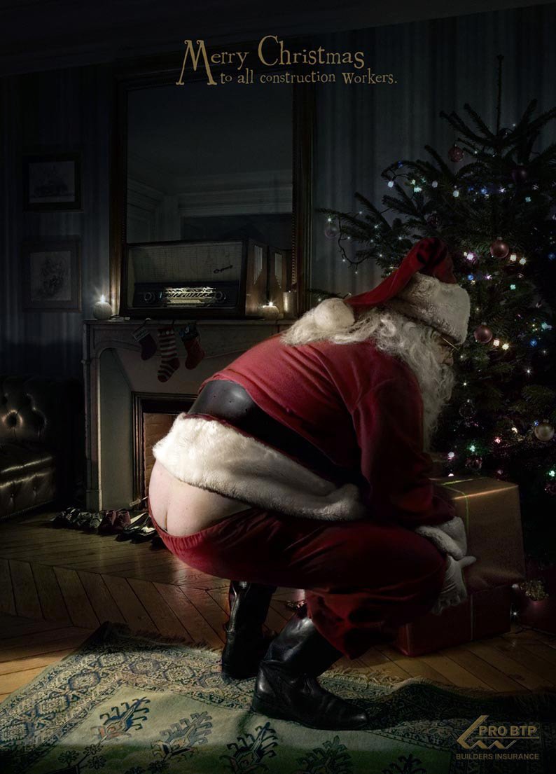
Merry Christm-“ass” Advertisement
My Thoughts:
This is an advertisement by an agency in France basically stating Merry Christmas to all construction workers. The text in the advertisement was likely included in Adobe Photoshop. The Santa could have been a separate image from the rest of the room but if it is the design team did a wonderful job making the design look natural. The logo was likely made in Adobe Illustrator but I am sure that it was saved as a PNG and then added to the design using Photoshop. Besides that, the rest of the design is all taken with a camera.
Elements of Design:
The size of Santa in this design comes into play and the viewer immediately notices that Santa’s butt is showing from his pants. I suppose the shape of the Santa could be mentioned here because he is hefty like I would expect Santa and/or a construction worker to be. The color of the design works with the idea behind the design that Santa is there at night delivering presents. The tone of the design is dark like I was saying which goes with the nighttime theme. There is relatively good symmetry and balance in the design seeing how Santa is centered on the page.
__________________________________________________________________________________________
Media: Print
Category: Electronics & Technology
Agency: Miami Ad School
Brand: Polk Audio
Geo: Americas, United States
Leave the noise outside.
Advertising School: Miami Ad School, San Francisco, USA
Art Directors: Caroline Tan, Carlo Clerici
Copywriters: Caroline Tan, Paula Henzel
Published: February 2014
The Print Ad titled Baby was done by Miami Ad School, San Francisco advertising agency for product: Audio Products (brand: Polk Audio) in United States. It was released in the Feb 2014.
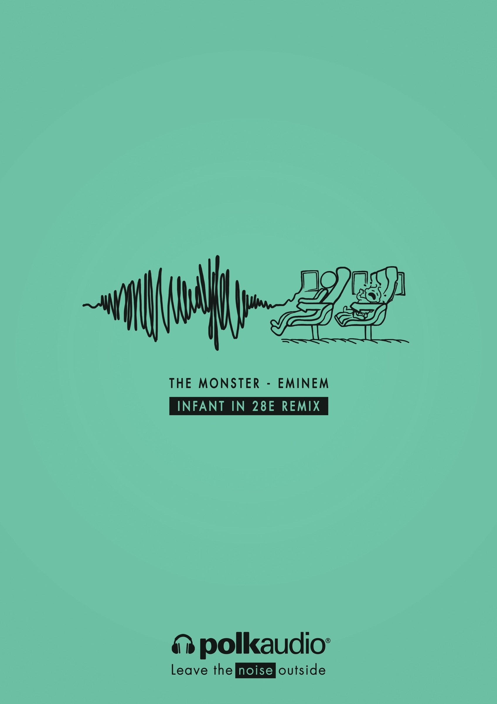
Polk Audio Advertisement.
My Thoughts:
This is a print advertisement done by an ad school in Miami for Polk Audio. I believe this advertisement was completed using Adobe Illustrator. It appears as if the person who designed this only used a few of the tool illustrator has to offer. The pen tool, text (probably created outlines with the text to make them vectors), the pathfinder tool or the shape builder tool was used to subtract the text from the box where it says “Infant In 28E Remix” and the logo was likely traced in Illustrator. The seats and the people were likely designed using the pen tool to create the shapes.
Elements of Design:
Line comes into play here with this design are the majority of the design is in fact outlined or just lines. There is a pleasing color to the background that gives the design a professional but still fun feel, but that may just be in my eyes because the background color is close to my favorite color. The direction of the lines in this design are a bit confusing because they don’t lead your eyes anywhere important. There is nice balance and symmetry since the text and the illustrations of the people sitting in the chairs are centered along with the Polk Audio Logo.
__________________________________________________________________________________________

Leave a comment